Sagmeister & Walsh
LANEIGE MEETS ARTS SAGMEISTER & WALSH
← Swipe left or right →

![]()
![]()
-
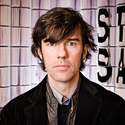
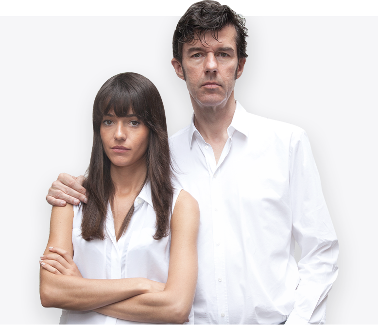
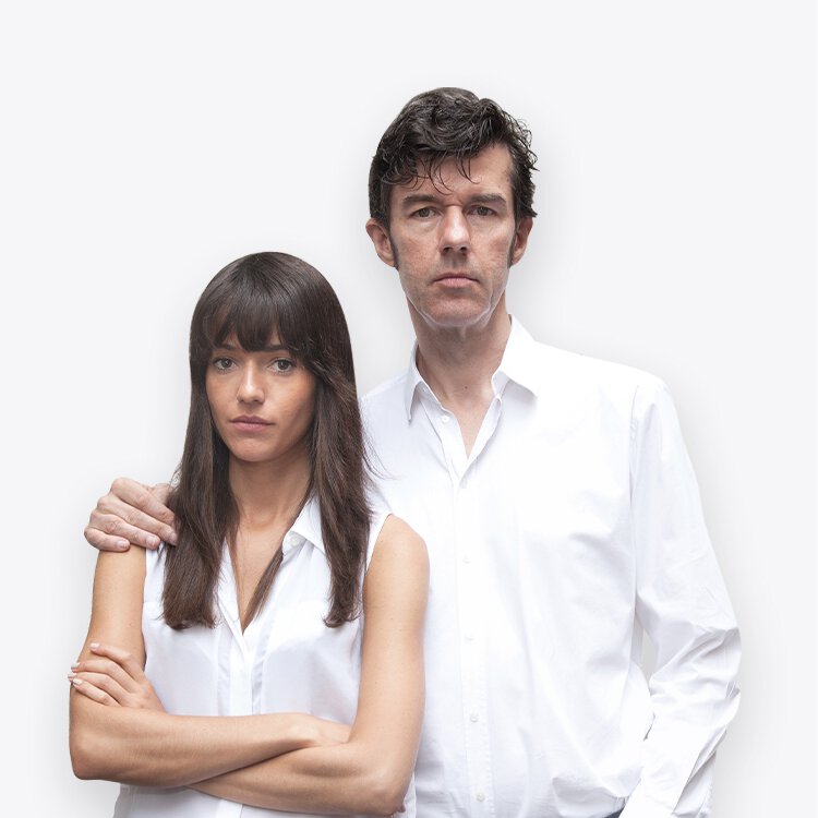
Stefan Sagmeister
"One of the living legends of the world, an artist who merges boundless beauty that astonishes the world, such as exquisite paintings, international art design, graphic design, calligraphy, as well as performances in various art forms."
-
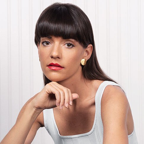
Jessica Walsh
With her outstanding and hard-to-match work, Jessica Walsh is a highly recognized graphic designer and creative director, including being named one of "30 Under 30" by Forbes magazine and in the "10 Top Visual Creators" by Ad Week magazine.
-
Q. We are very honored to work with you! Could you please introduce yourself to us?
Hello! We are Jessica Walsh and Stefan Sagmeister. We have come together under the name "Sagmeister & Walsh" for the past 10 years. We have experience working on a variety of projects, such as creating identities, advertising, films, books, and more for clients, interested parties, and ourselves! Additionally, we have worked on major projects, such as creating the identity for the Jewish Museum in New York, which showcases our work and books. We have also taken on projects related to beauty brands, such as branding and advertising for a department store in the Middle East called Aїzone.
-
Q. Can you share your feelings about working with LANEIGE?
"We have collaborated with various cosmetic brands, each with different perspectives, which helps enhance various dimensions of our work. For this brand, we exchanged views to generate ideas that cover all aspects. We believe in sharing ideas from real experiences for design purposes rather than relying solely on results from various tests."
-
-
Q. "Artistic lettering" seems to be unfamiliar. Can you define its meaning?
Calligraphy is an art that combines letters and layout design that has been created and crafted.
-
Q. What do you think about the word LANEIGE?
When we designed the meaning of this word together?The English word for ‘Laneige’ is very elegant, as the pronunciation and letters are designed to convey a sense of lightness and comfort. We are very excited to design this word, as each letter has its own unique characteristics. We incorporated various playful elements to highlight the features of each letter, such as animations, colors, and sounds, to make the letters appear bright and lively, showcasing a different dimension that stands out. At first, when we received the logo and the brand's monogram colors, we were impressed by the simplicity and luxury of the brand. The letter design is simple yet modern and confident. The colors of the monogram are complex yet easy on the eyes, as if designed in golden proportions, featuring silver, blue, and black, perfectly blended with the illuminating light.
-
-
-
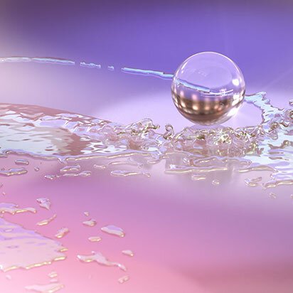
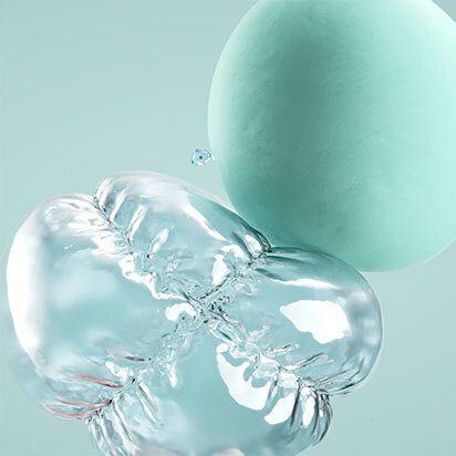
Q. What should be particularly considered in showcasing the beauty of water?
The movement of water is what we consider most when making the video. In addition to expressing the purity of water, the shape of the water is also something to pay attention to. We work very hard to showcase the movement and various shapes of water. It requires a lot of attention and high-level skills.
-
Q. In the Millennials era, where there is diverse content through various media, especially visual media, what ideas or perspectives do you expect from the audience in this presentation?
As mentioned above, we want the audience to receive something more than just short videos on social media that are scrolled past. Because what we aim to convey is not just entertainment or general media, but a beauty that will resonate with all the senses. We strongly hope that the Millennial audience will change their video-watching behavior from quickly scrolling past to watching each clip we present in various ways.
-

Since 2020, our lives have become increasingly digital.
"After the pandemic crisis that occurred, LANEIGE chose to communicate"
with customers through digital formats using artwork created in collaboration with
Sagmeister & Walsh to communicate a bright and healthy lifestyle.
-
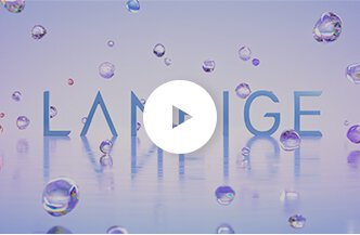
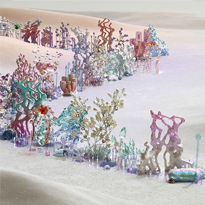
LOGO
-
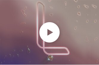
MONOGRAM
-
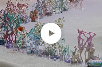
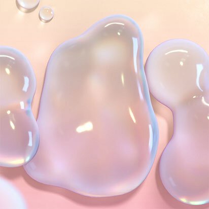
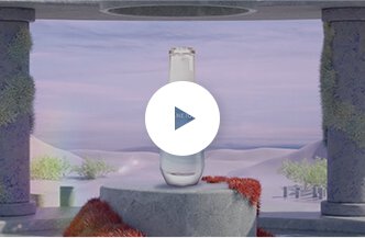
WATER
-
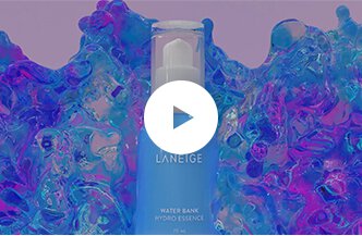
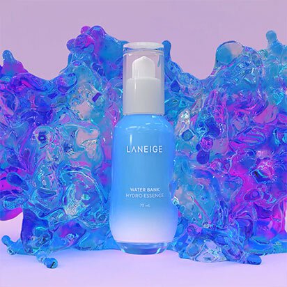
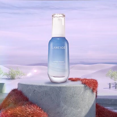
WATERBANK ESSENCE
-
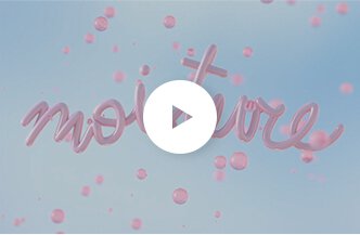
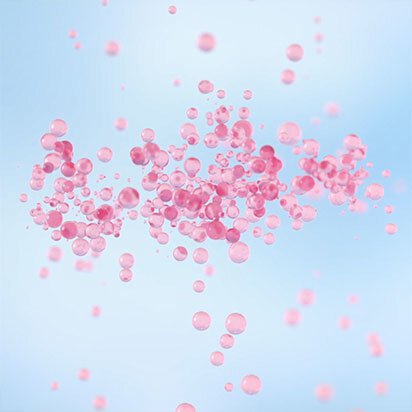
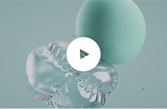
MOISTURE
-
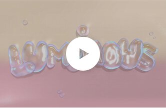
LUMINOUS
-
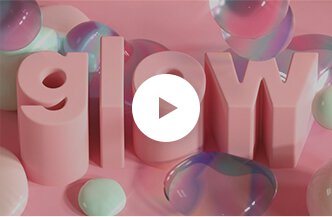
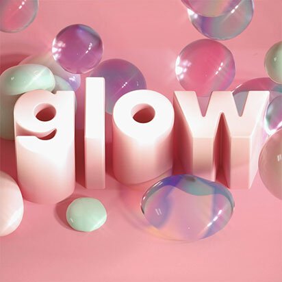
GLOW
-

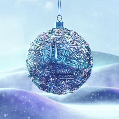
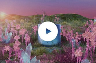
HOLIDAY

In 2021, the duo artists brought the best-selling products of the brand to tell a new story.
"By presenting it as art on a digital platform, we want to communicate the story of the brand."
"And the quality of these products to customers through the perspective of artists that will open new experiences."
And the most impressive perspective of the brand that we will offer to you.
-
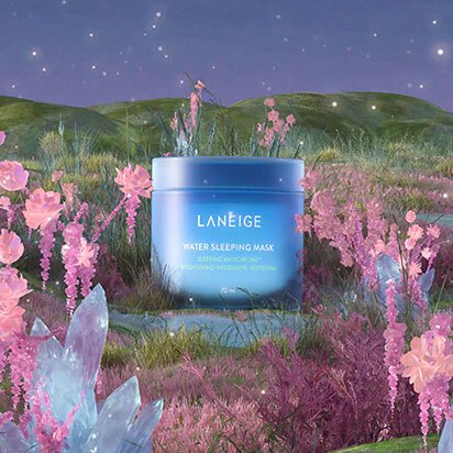
#WSM
-
#Waterbank
-
#NEO Cushion
- Choosing a selection results in a full page refresh.